This mockup was created using AI prompts and traditional compositing
Case Study
Overview
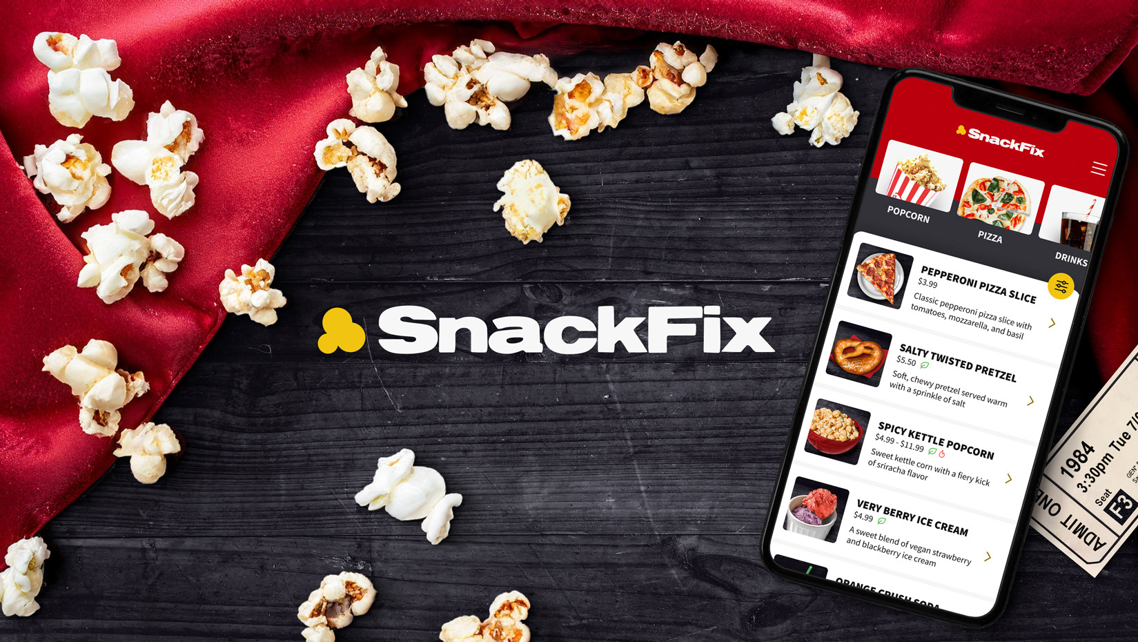
SnackFix is an on-demand snack ordering app designed specifically for movie theaters, offering complimentary seat delivery to help reduce long lines and interruptions. SnackFix caters to dietary restrictions by providing easy filtering of snack options to help those with specific needs.

Impactful products are essential for solving real world problems. 🌎
Imagine you are at the movie theater with your partner after a long day at work. You have a dairy allergy and a leg injury, and you would like to find a way to get some popcorn before the movie starts. The building itself is an overwhelmingly large venue that feels like a maze, and the walking back and forth to find the snack kiosk is becoming a challenge, but you make due because you are hungry.
By the time you make it to the snack kiosk, you are met with a long line of people ordering before you. Concerned about your dairy allergy, you squint to see the menus on the wall to discover there are no labels. In a panic, you start googling to find out the ingredients list before you get to the counter, with no luck. At the counter, you ask the employee if the popcorn has dairy, and he proceeds to hand you a huge binder for you to read the ingredients list yourself. This feels embarrassing and tedious, but you look through it anyway to order with peace of mind.
This is not an ideal movie theater user experience that considers accessibility and dietary needs of their customers.

Challenge
Many people experience long wait times and unclear food labels while ordering snacks in movie theaters. Under the Google UX Design course, I was tasked with UX Research and the launch of a new iOS app.
Role
Role: UX Researcher, UX Designer, Visual Designer
Timeline: 1 Year
Platform: iOS Mobile App
Approach
Qualitative Research
Competitive Analysis
Unmoderated Usability Study
Persona Building
Journey Mapping
Affinity Mapping
Results
SnackFix offers free seat delivery options throughout the checkout flow to allow users to enjoy uninterrupted movie time. The app also prominently features dietary modification filters with full ingredient transparency to help empower users to order snacks with confidence.

Process
A competitive audit of four different companies were chosen based on their direct or indirect association to movie theaters and food ordering. The goal is to identify pain points that will be addressed in the future design.
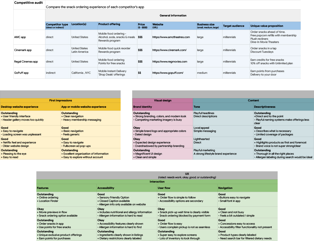
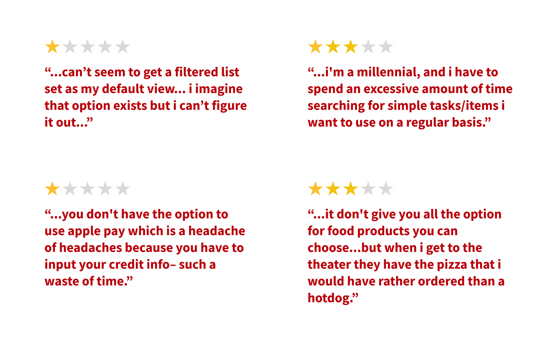
For more insights on pain points, I pulled a few highlighted themes of user complaints from app store listings to give further insights on user needs.

Research Summary
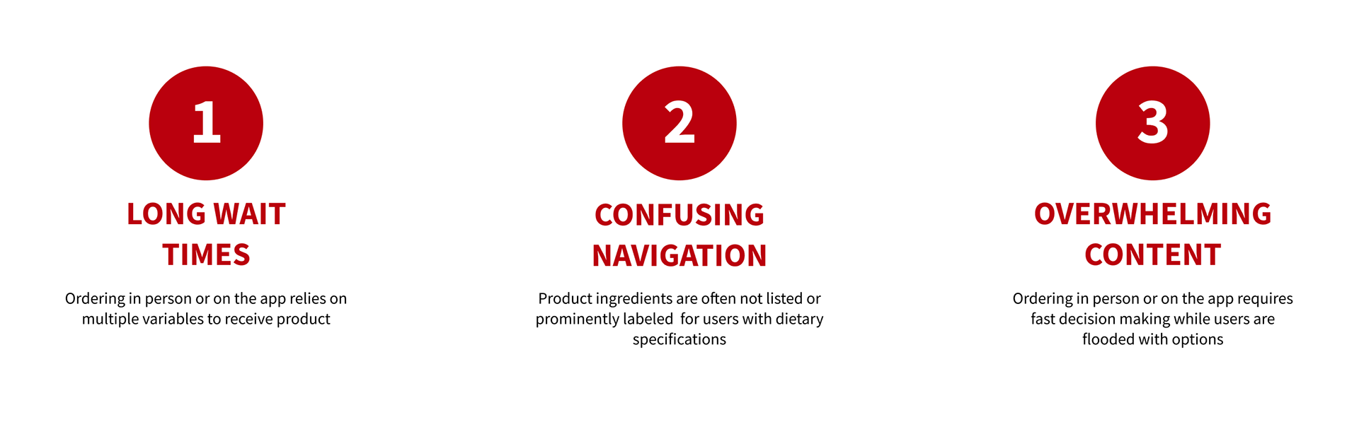
Based on the preliminary research, the findings highlighted a few pain points consistent across all products.
Research Goals
Going into this study, the hypothesis is that it will require a significant amount of development to accommodate time management, limited mobility and dietary restrictions due to consistent feedback patterns present in the top leading movie theater snack apps.
The goal of this research study is to discover solutions for long wait times, confusing navigation, and overwhelming content.

Research Methodologies
I conducted an unmoderated usability study with 10 participants that align with the target personas. These personas were selected through a network of vetted recommendations. Each user was given a list of tasks and required to document their user journey.

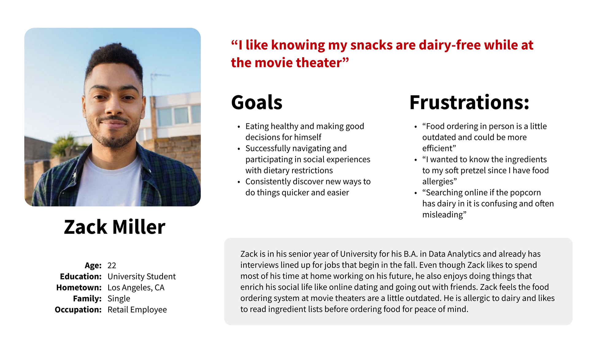
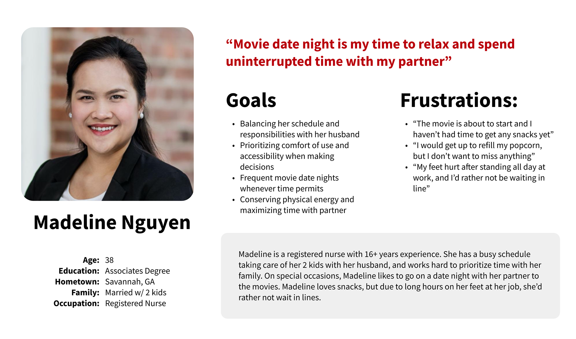
Personas
Through market research, two personas emerged from my findings. Zack Miller represents those seeking unique dietary needs, while Madeline Nguyen represents those seeking time management and accessibility considerations. Both personas are fictional.

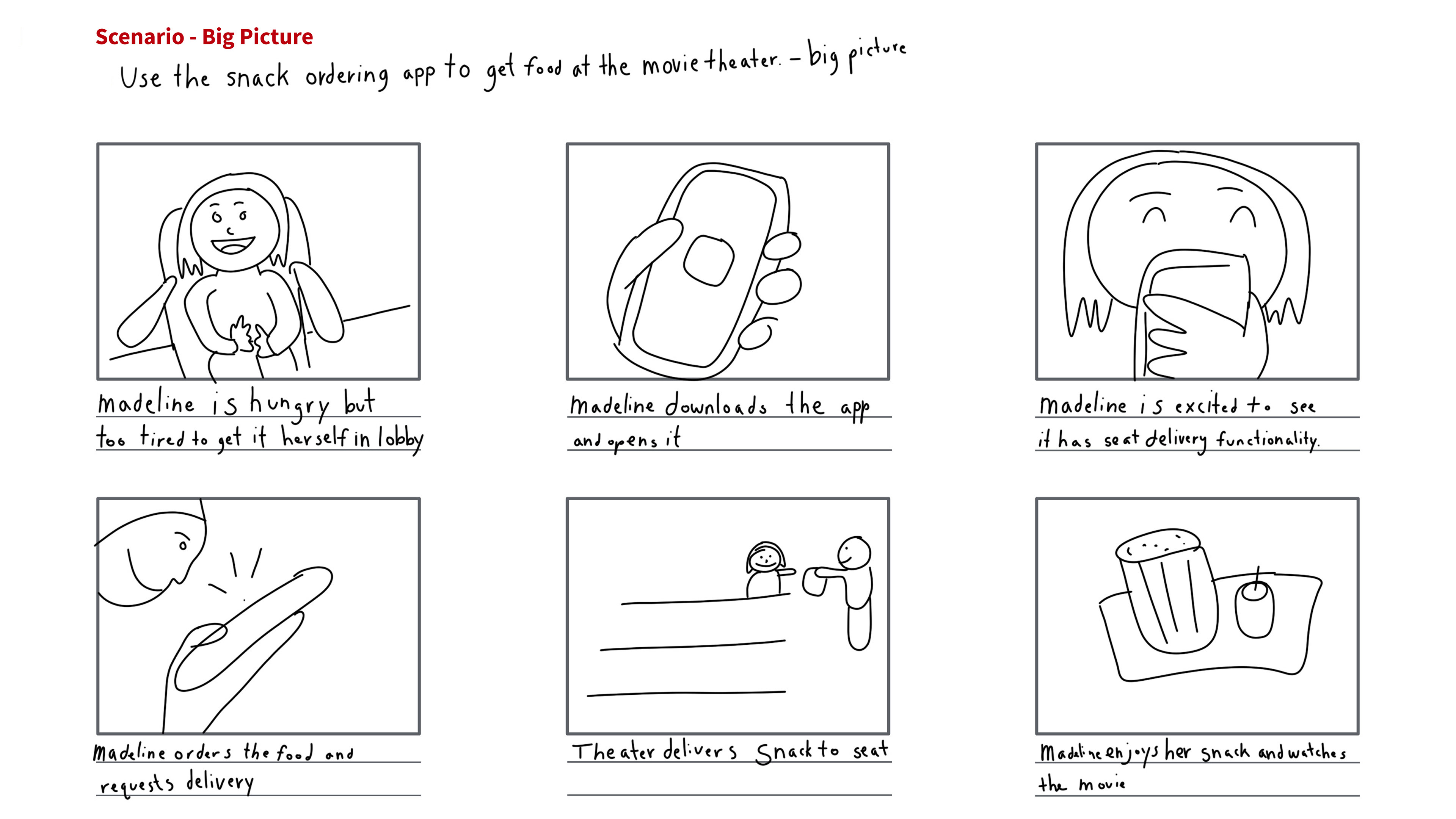
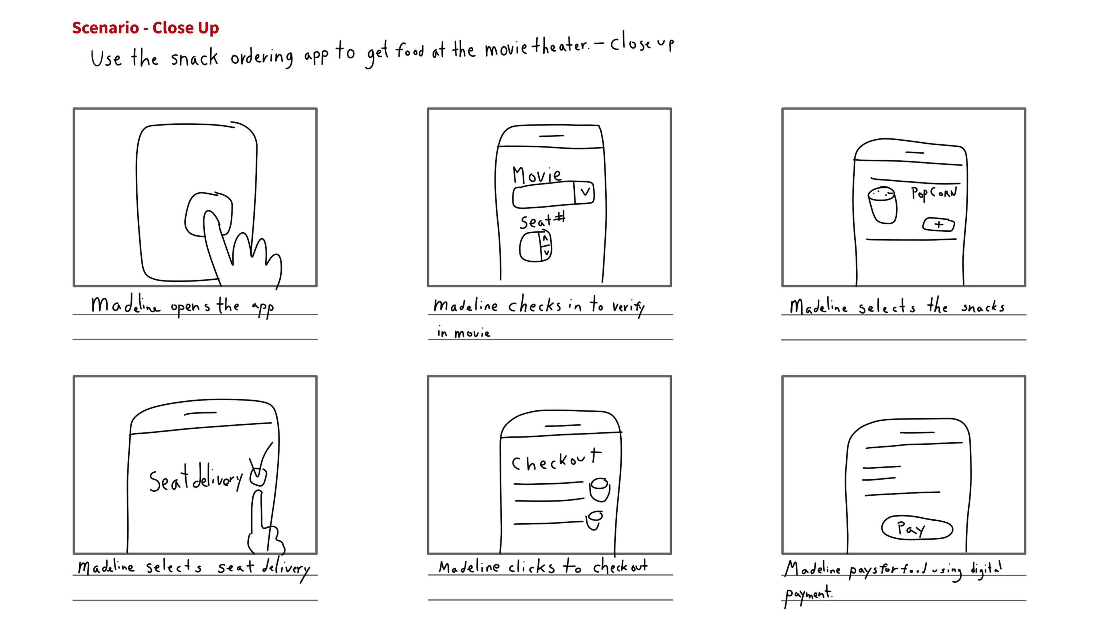
Storyboards
I approached these storyboards to visually depict the user journey of our personas, capturing both the broader perspective and detailed moments that highlight both user needs to address what screens are required.
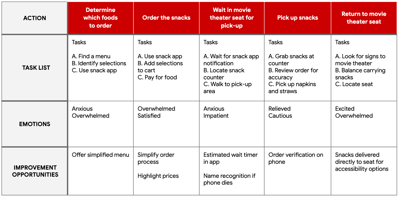
Journey Map
The goal is to provide our personas both dietary and accessibility accommodation so they can enjoy a convenient snack experience from their seat.
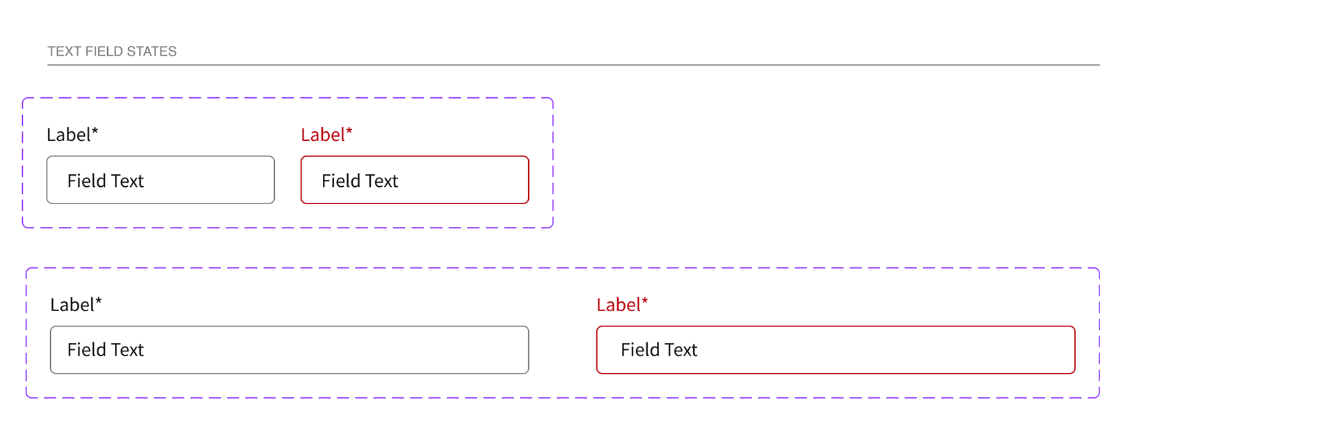
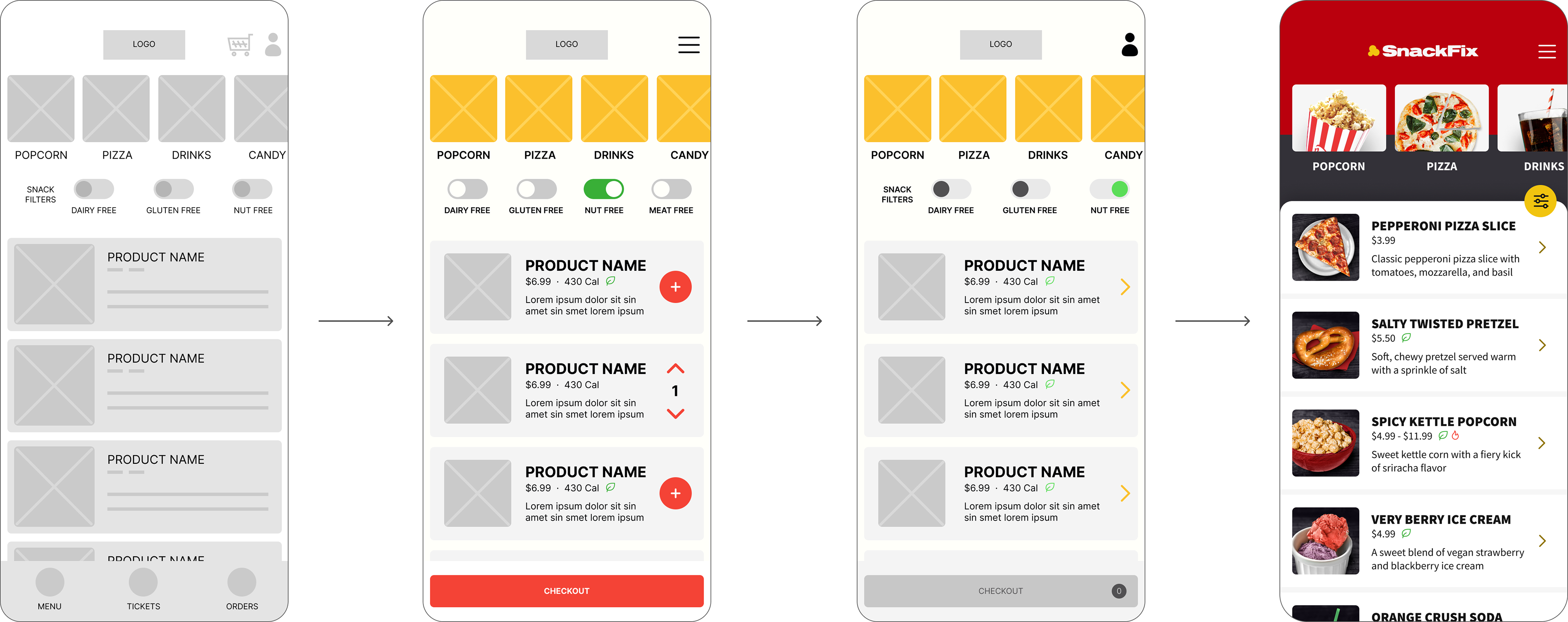
Wireframes
I aim to create a streamlined user experience for snack ordering, emphasizing clear navigation, labels, and accessibility considerations, while minimizing barriers and potential biases. I have included additional screens that may be unnecessary in the final version for testing purposes, ensuring a thorough evaluation of the design.
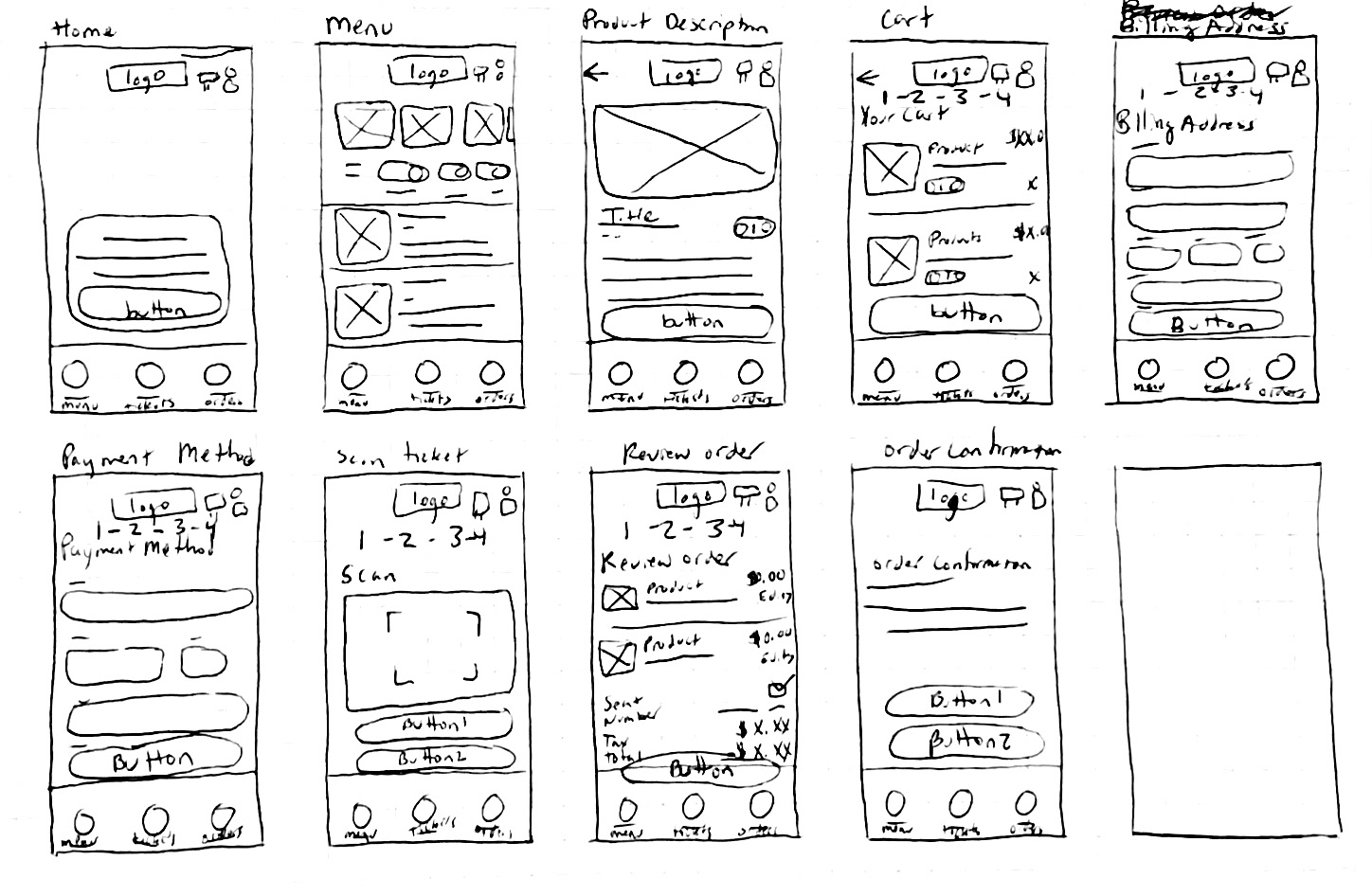
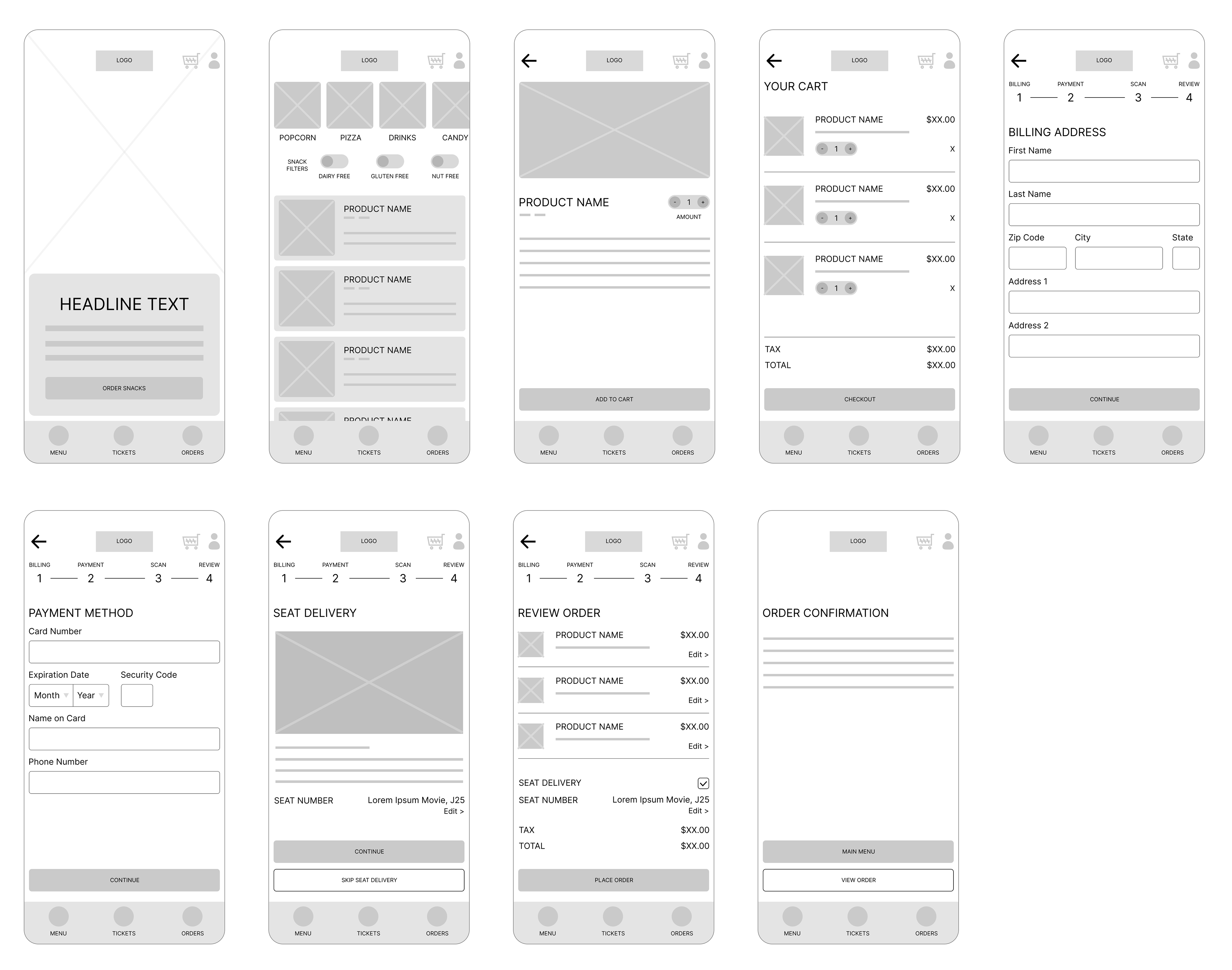
Lo-Fidelity Prototype
This prototype was built using Figma. Many variations of this design were made until landing on a design that most accurately represented the proof of concept. My goal was to include as much app functionality as possible for user testing.
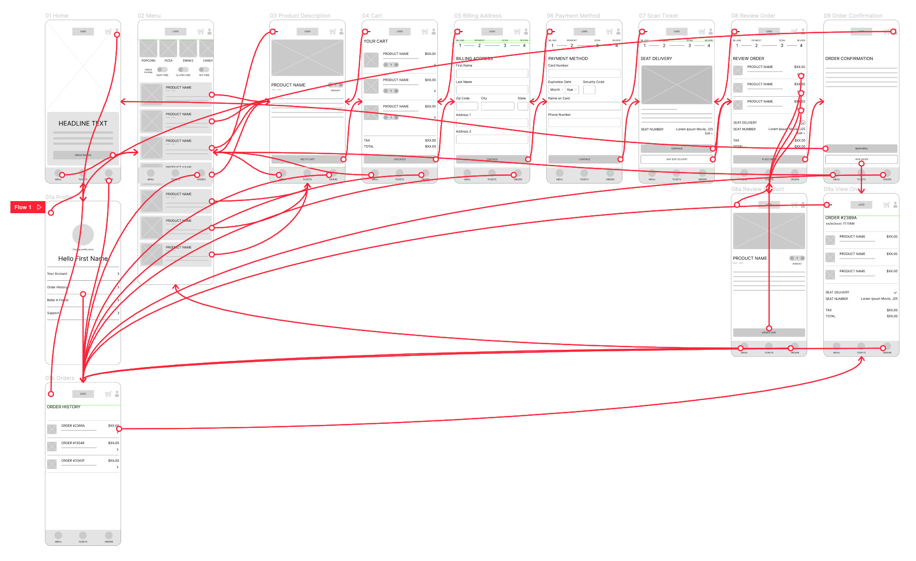

Usability Study Findings
I conducted an unmoderated usability study with 10 participants that align with the target personas. Participants then completed a System Usability Scale questionnaire at the end while answering a few questions. This study took 15-20 minutes to complete per user.
The outcome is an MVP prototype that required immediate navigation modifications that needed to be addressed.
The outcome is an MVP prototype that required immediate navigation modifications that needed to be addressed.
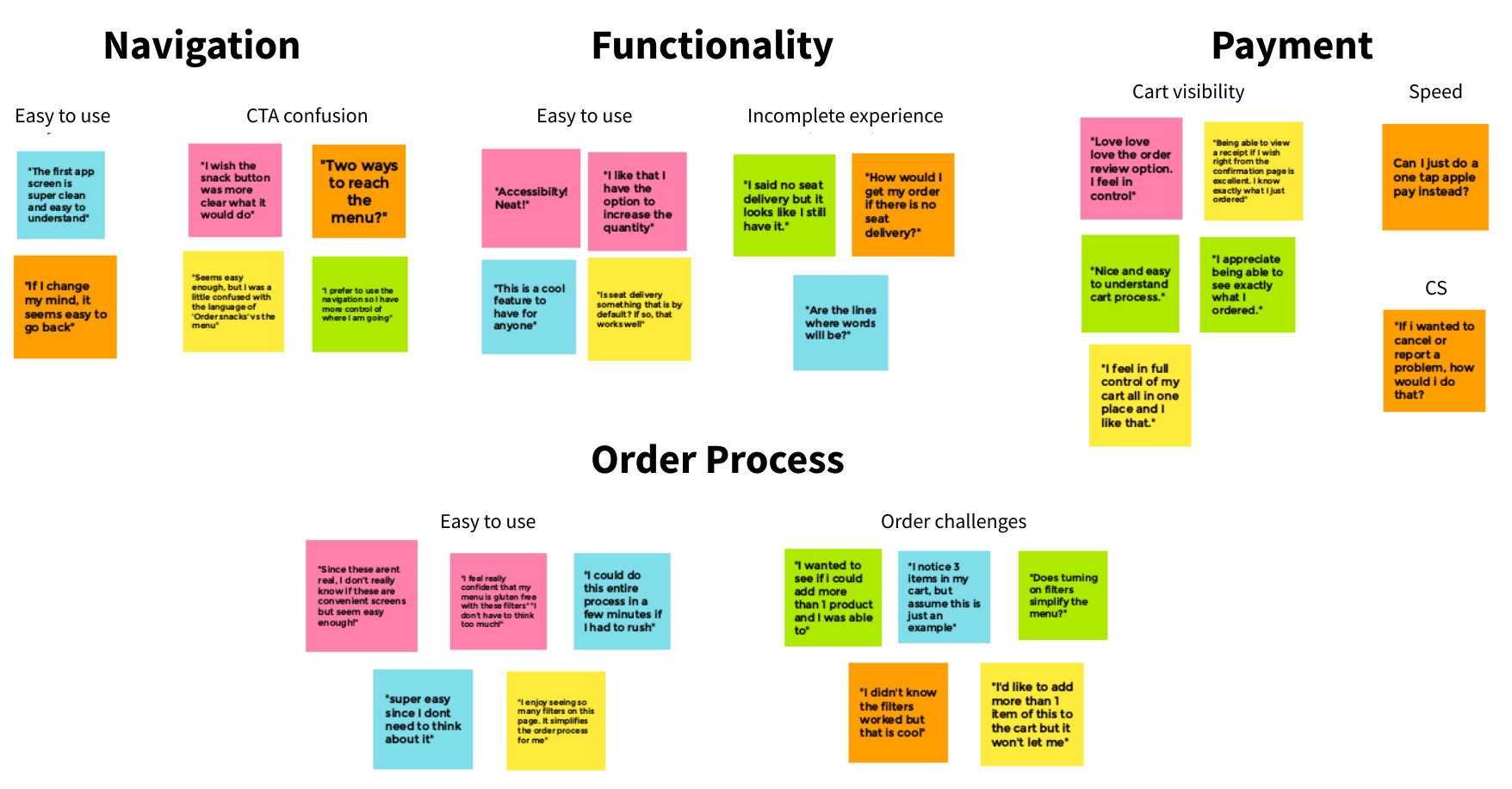
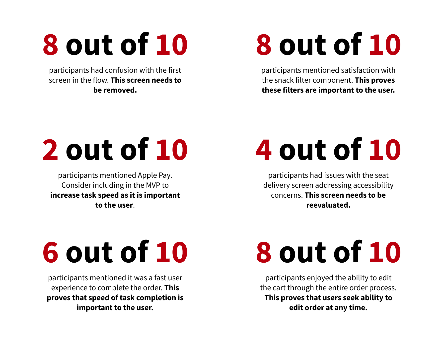

Design Iterations
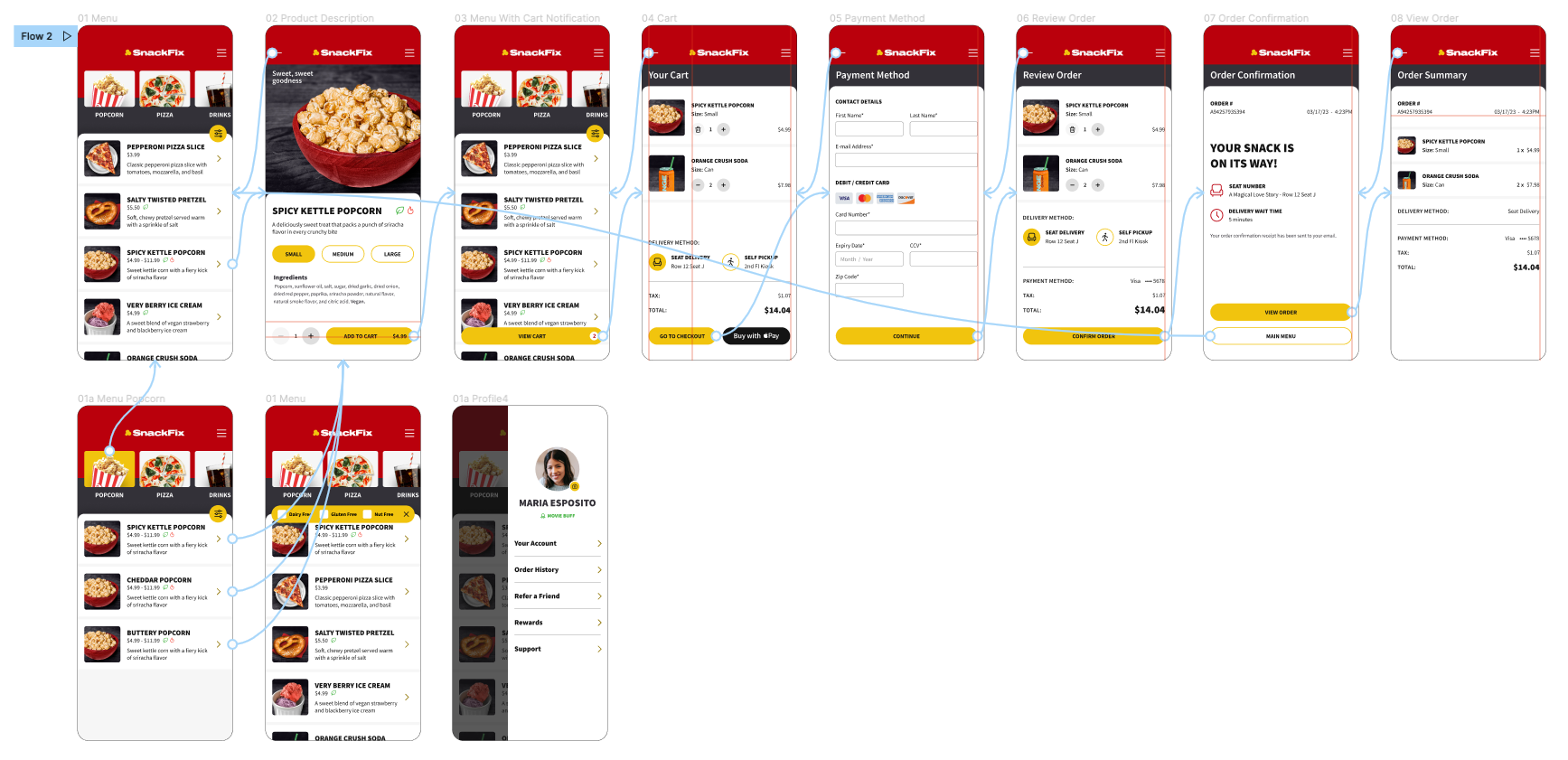
Based on the results of the Usability Study, I focused on a few key factors- Menu navigation, payment methods, snack filters, and seat delivery. I developed multiple variations alongside small moderated usability studies to refine the experience to ease any remaining pain points.
After removing the splash screen, I went through many different prototypes exploring the filter and cart experience. The checkout button and cart was also tested and removed on this initial screen.
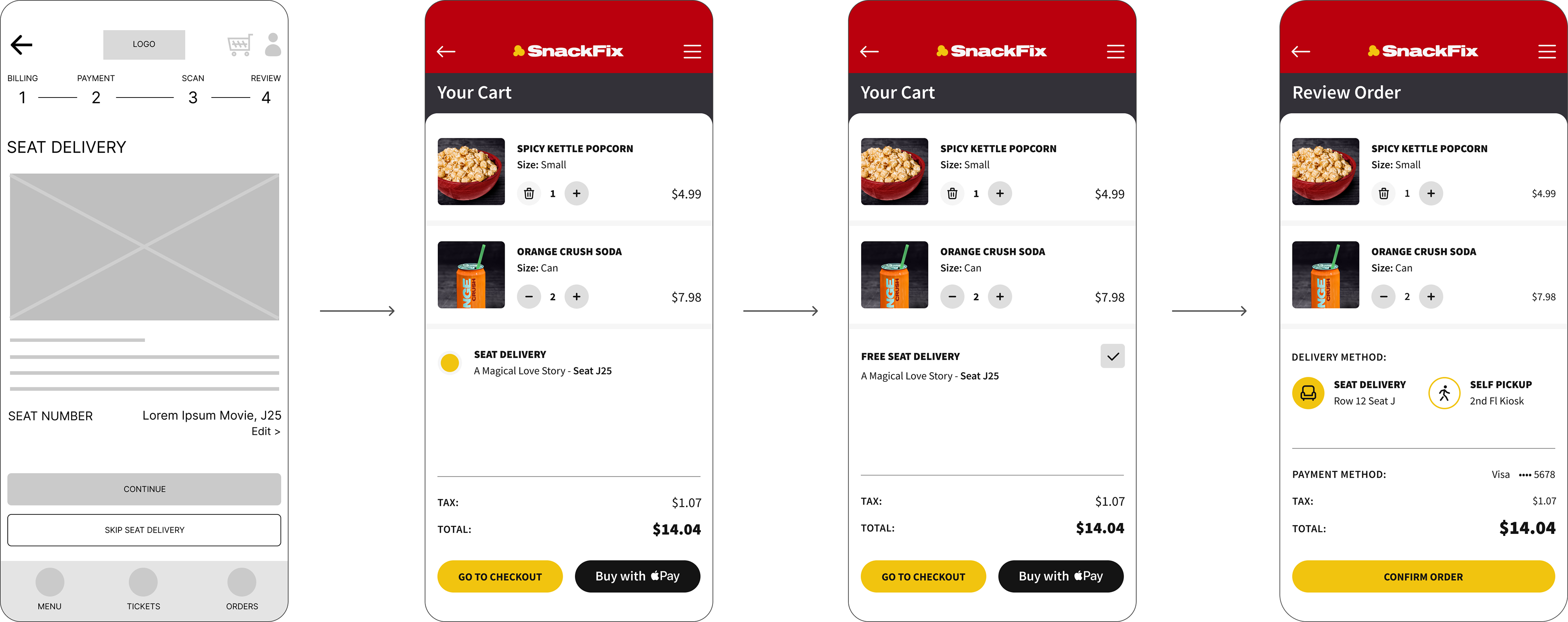
Addressing accessibility concerns, the seat delivery scan screen was removed and replaced with a clear button selection on the review order screen.
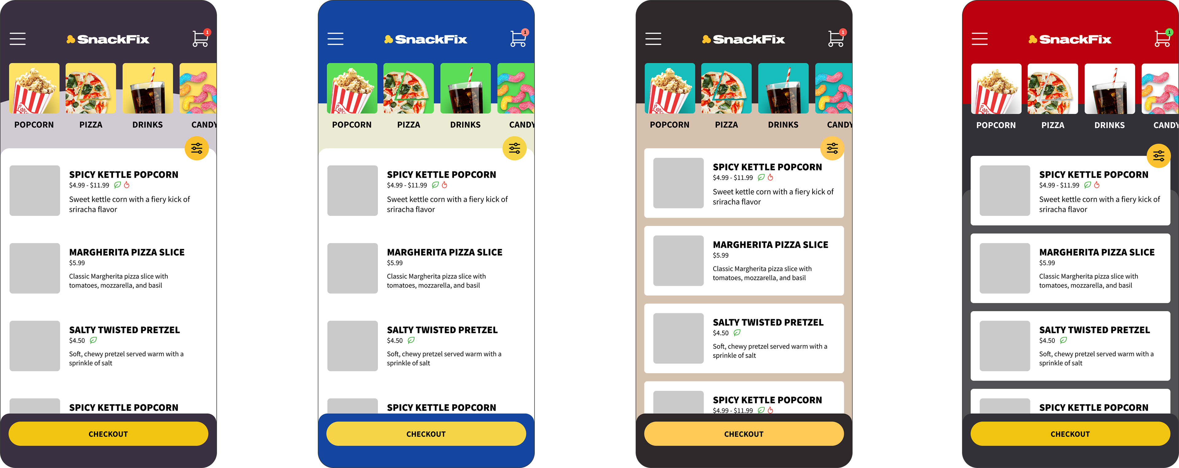
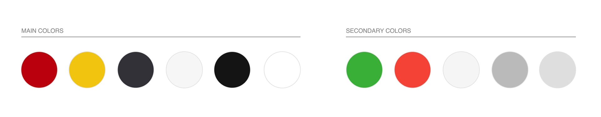
At the early stages of UI, various color explorations were tested and vetted through surveys to meet user expectations.
Hi-Fidelity Prototype

The Results
The MVP release of the SnackFix app incorporates key features that target specific user pain points and delivers an experience that is easy, accessible, and efficient.

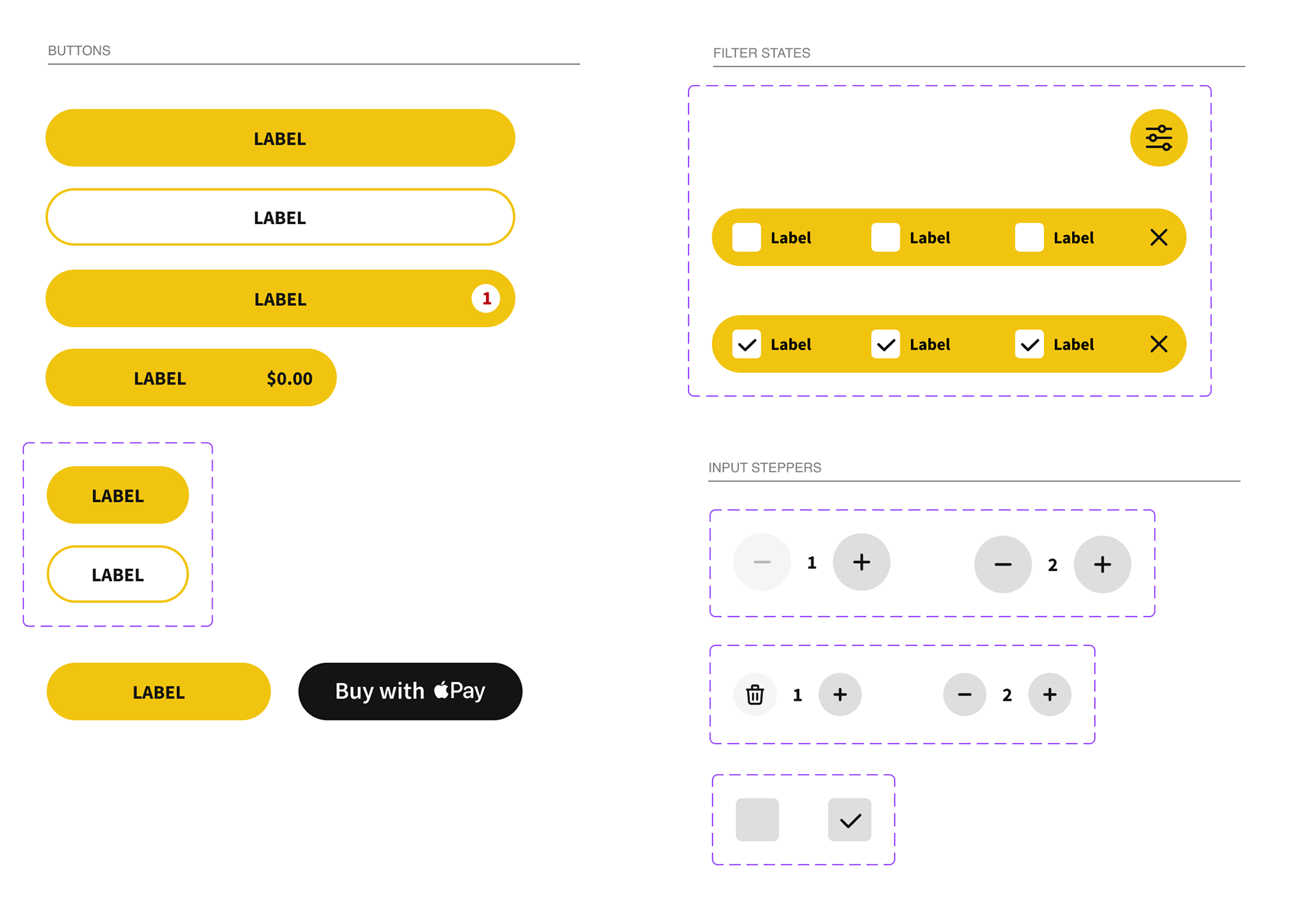
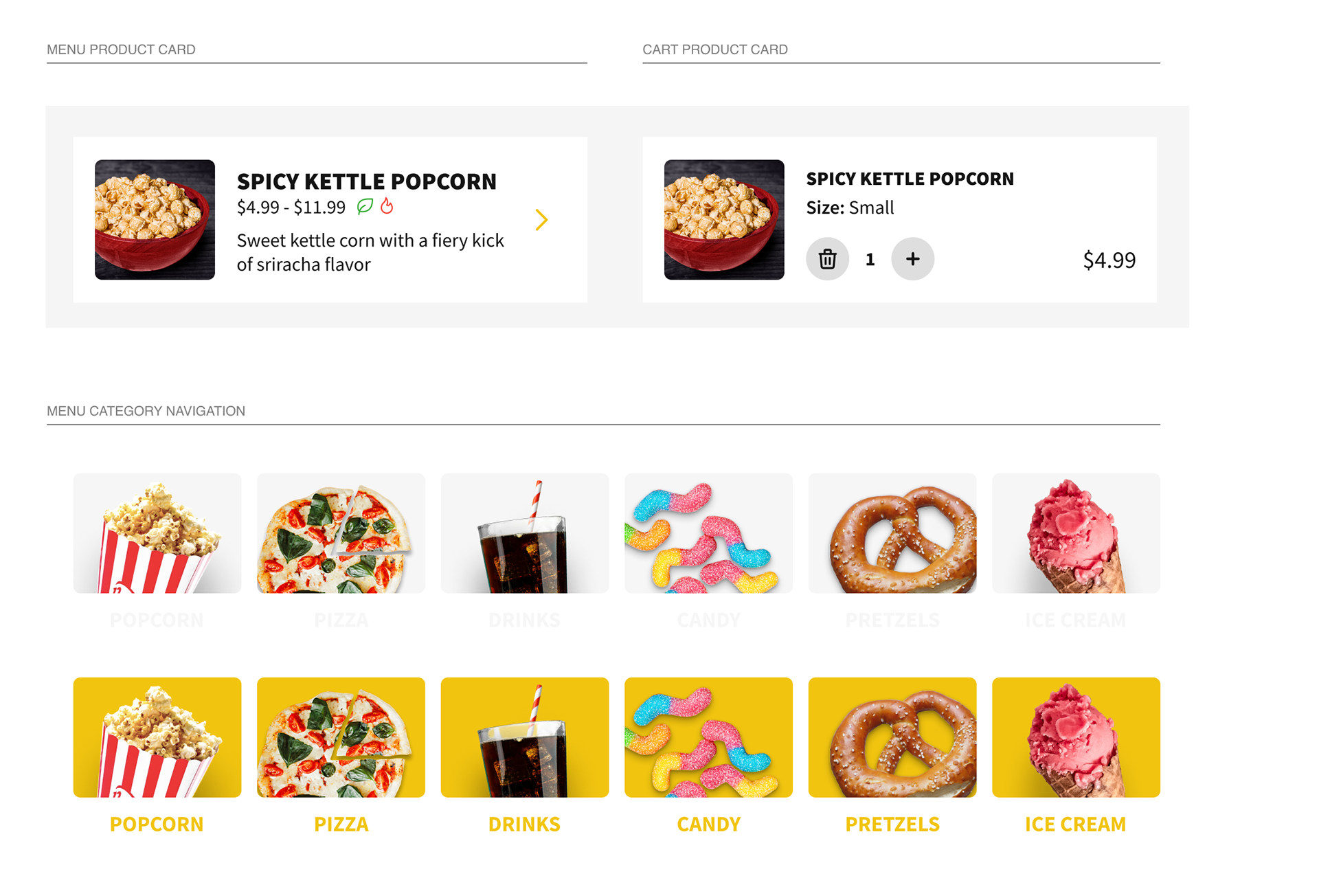
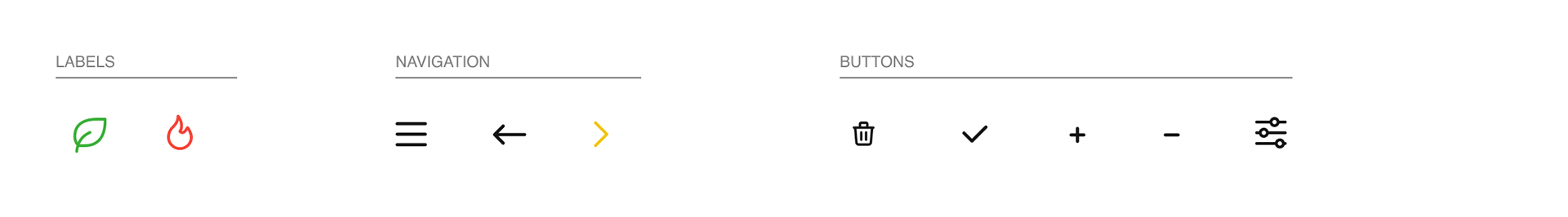
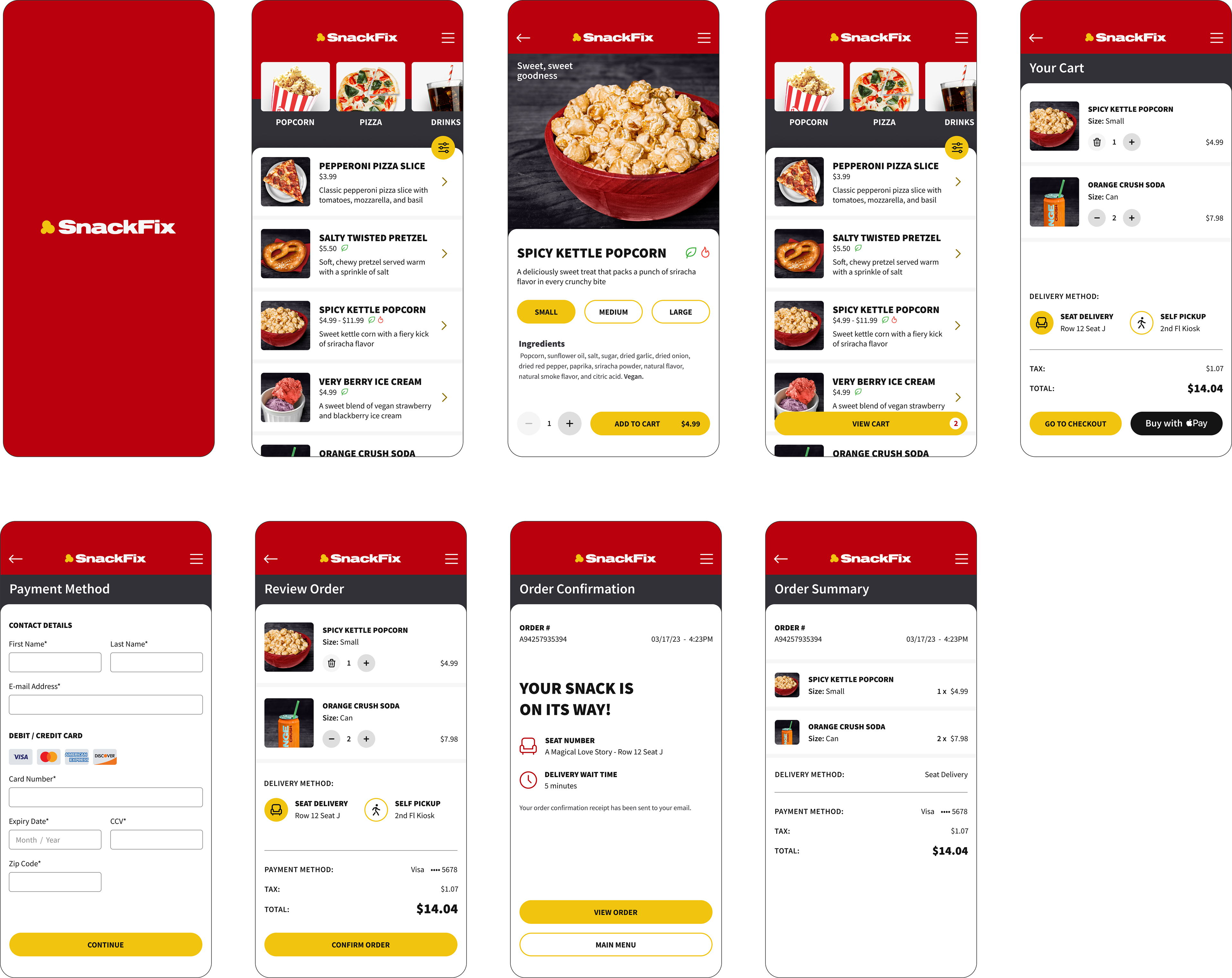
Dietary Modification Filter
Filter your menu to see only the snacks that fit your personal needs. Dietary icons are clearly indicated.
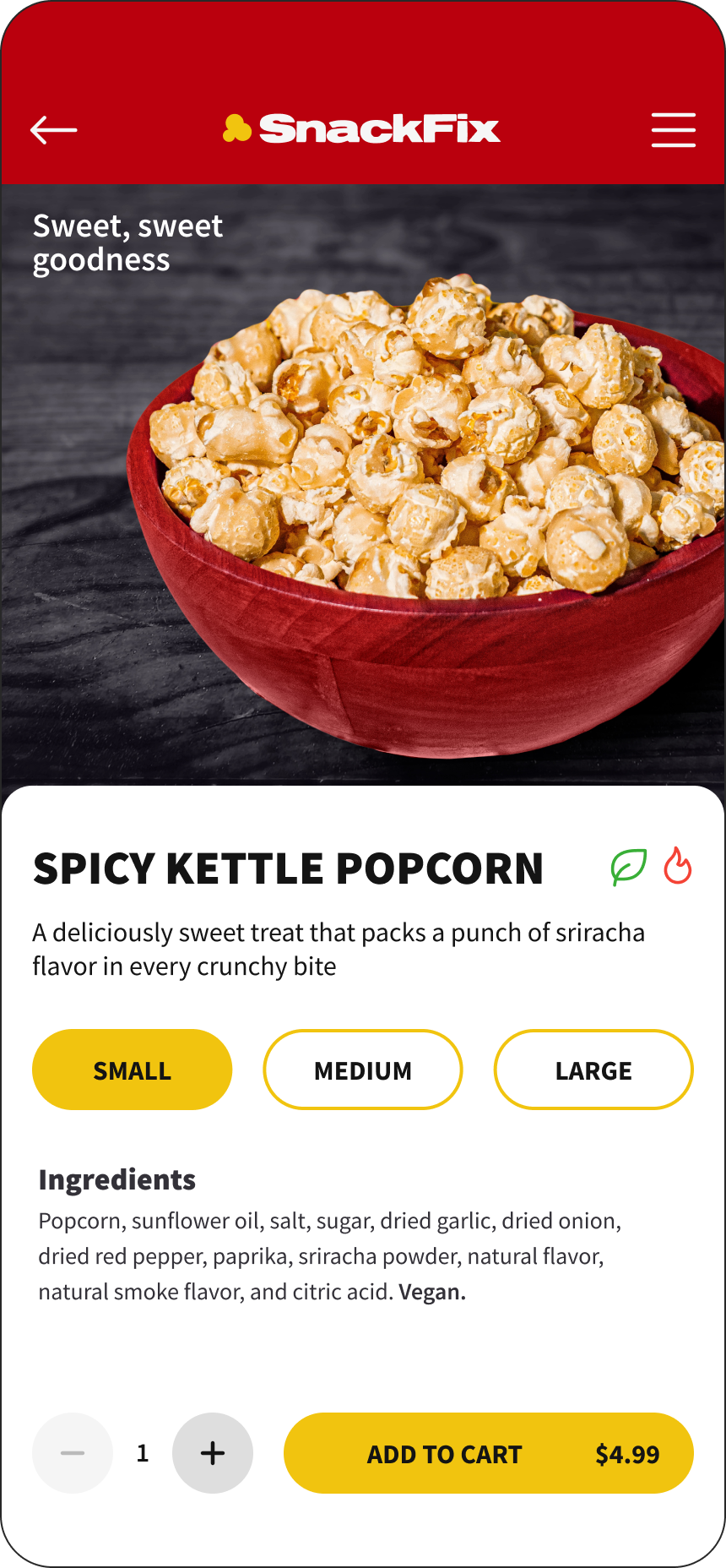
Prominent Ingredients & Labels
Transparent ingredient lists and clear labels makes ordering a breeze. Know exactly what you are eating without having to look elsewhere for the nutrition facts.
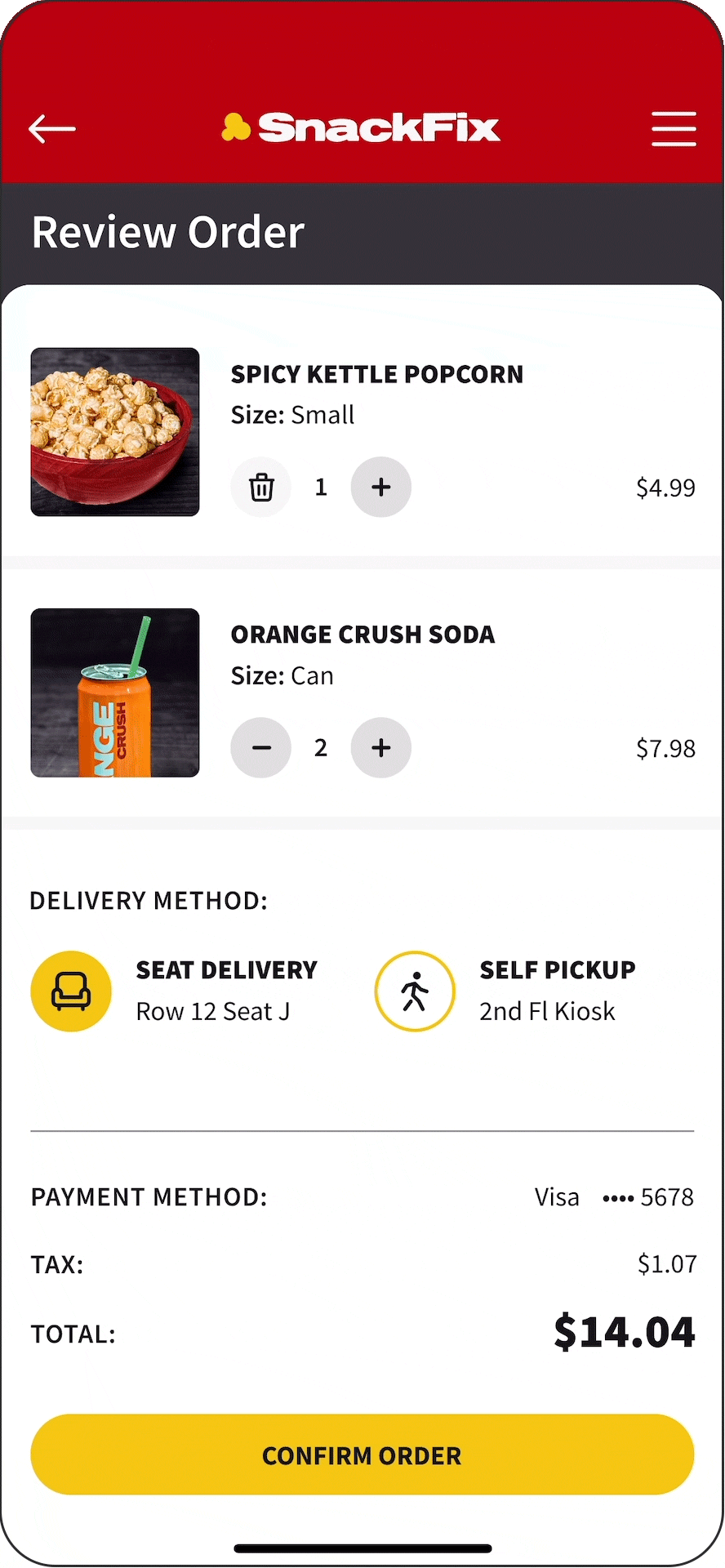
Seat Delivery Option
No need to wait in lines. Free seat delivery or self pickup meets accessibility requirements for all users.
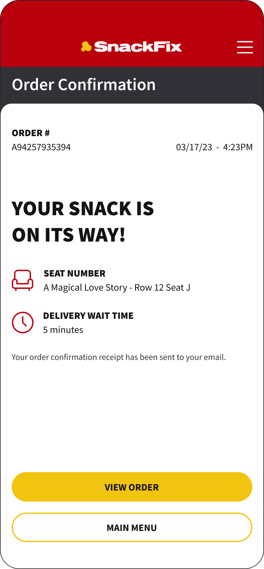
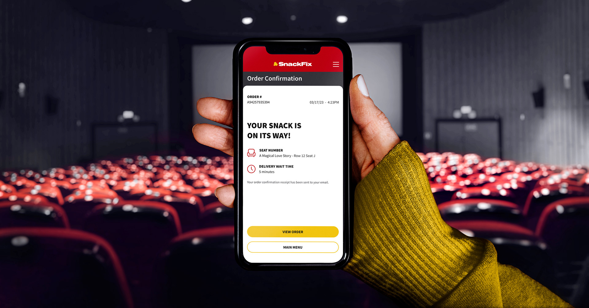
Clear Delivery Expectations
Sit back and enjoy the movie knowing your snacks are all taken care of! Curious about the status of your order? Check your app!
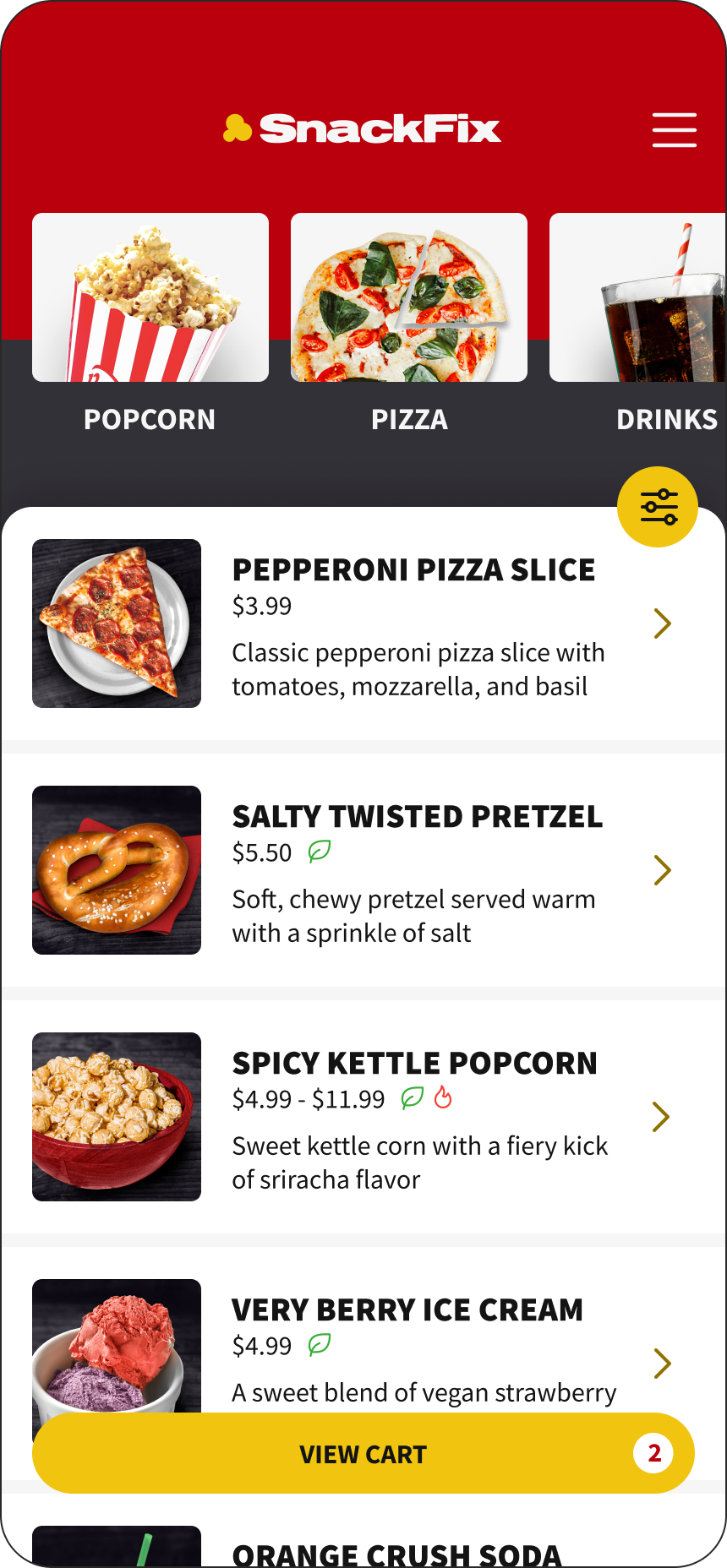
Active Cart Button State
A cart button that reveals itself only with active items in your cart! Equipped with a cart quantity indicator.
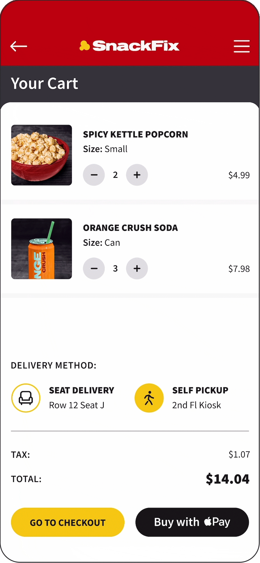
Real-time Cart Updates
Change your mind at any time! Real-time cart updates reduces the need to move back during the order process.
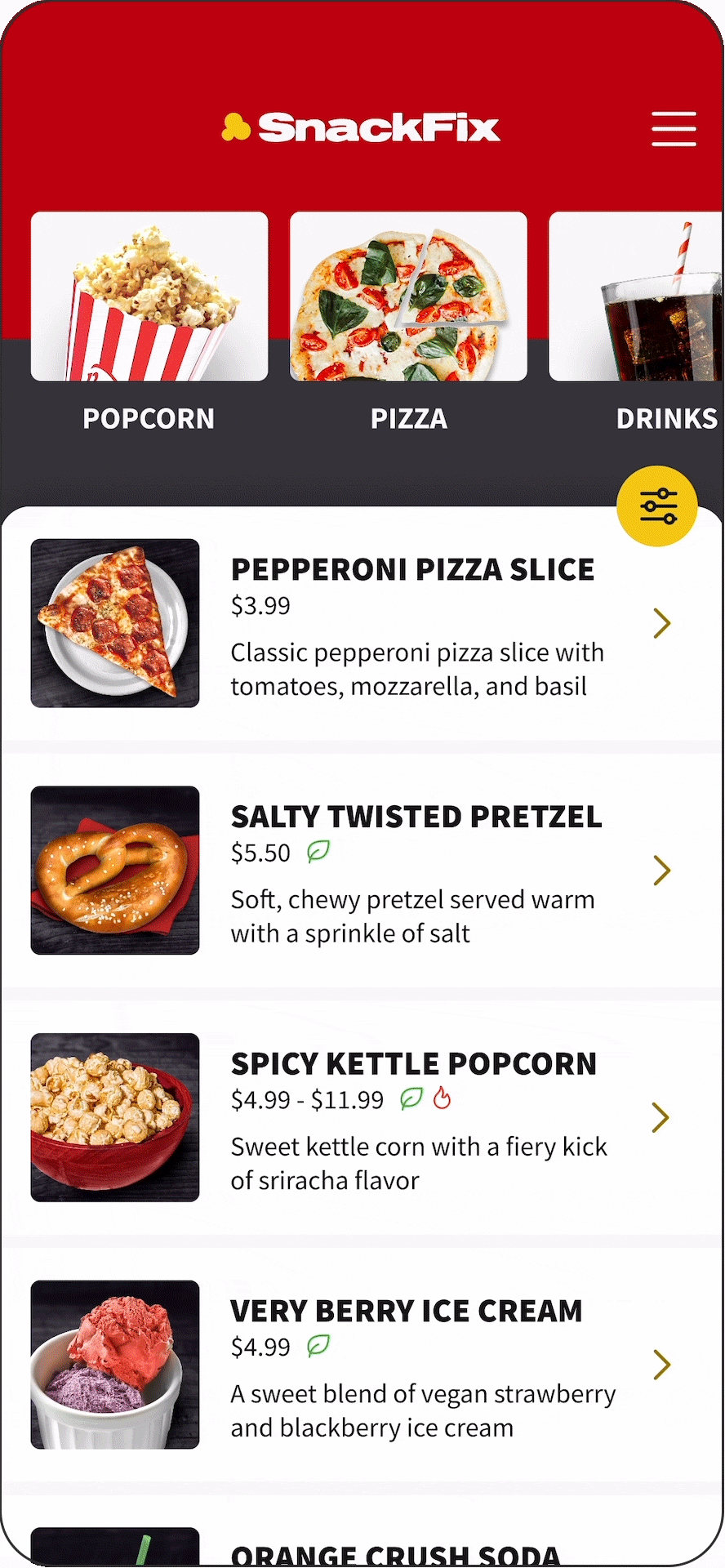
Snack Category Filters
See only what you want to see by highlighting the categories you are interested in. Less distractions, faster orders!
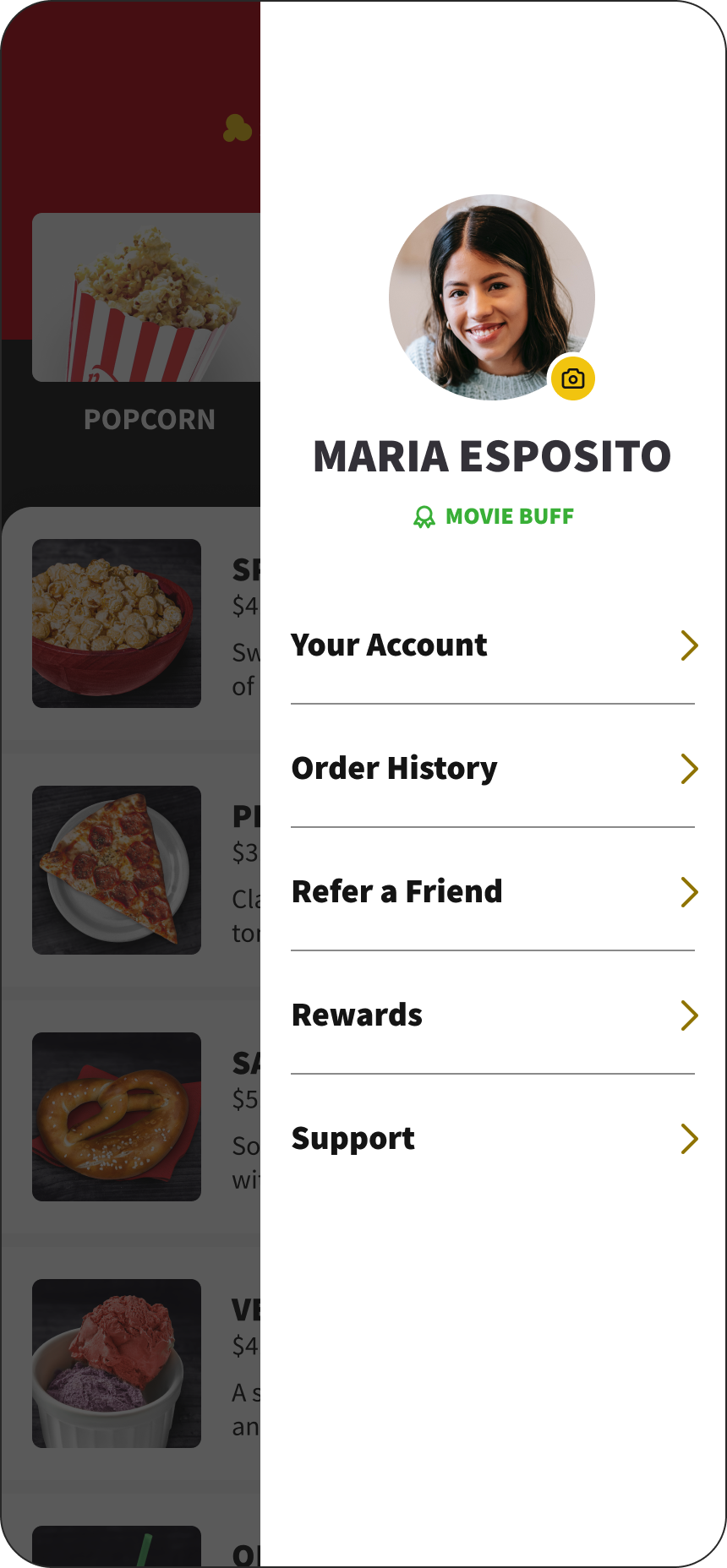
Personalized App Experience
Connect your movie experience by logging in to your account! Keep track of past orders, rewards, seat tracking, and more.
Next Steps
For the next round, including more moments of delight throughout and adding achievements would make for a better user experience. I would also further incorporate the movie ticket purchasing experience into the app more directly as they currently feel disjointed and an after thought.
There are many aspects to this app experience that require further exploration, particularly in the profile menu. The account, order history, refer a friend, rewards, and support need to be developed as they are currently non-functional.
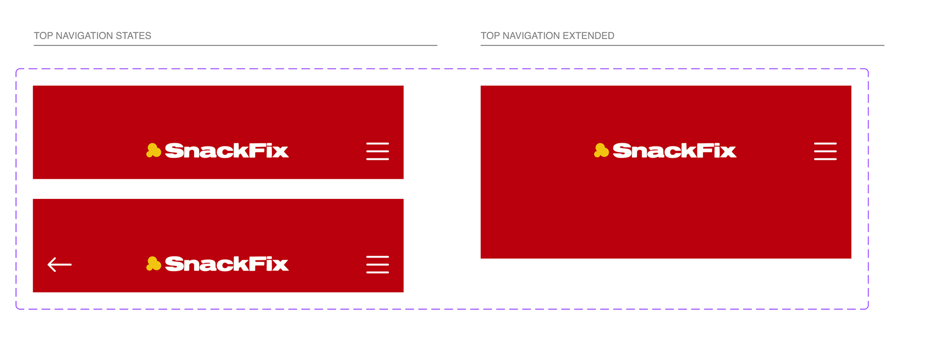
Branding

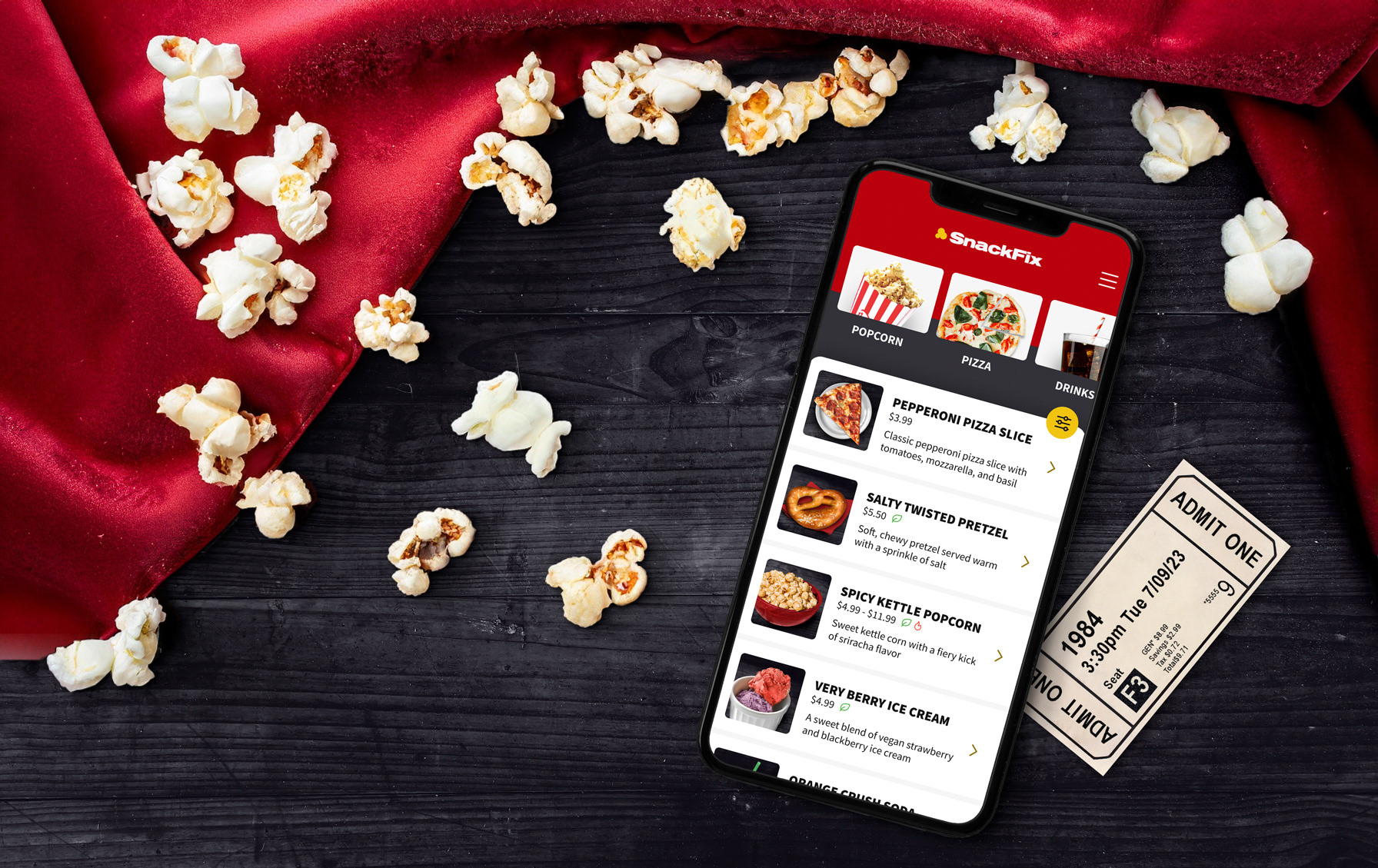
This mockup was created using AI prompts and traditional compositing
Sticker Sheets